Photo courtesy of MLB.com
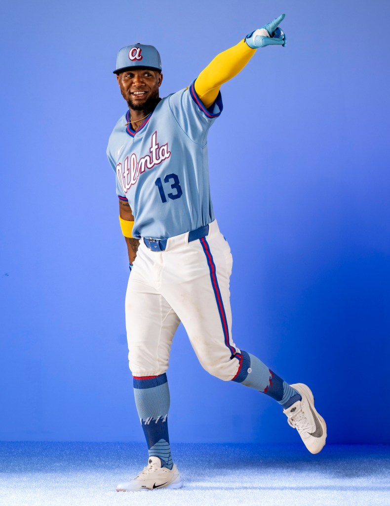
The Atlanta Braves: The Braves are bringing a modern twist to their old-school powdered blue uniforms and the block script ATL.
The Baltimore Orioles: Inspiration was pulled from the logo of the Baltimore Baseball Club back in the 1890’s for the B on the cap. Additionally, the jersey features nods to Camden Yards’ wrought iron scoreboard clock and the brass home run plaques.
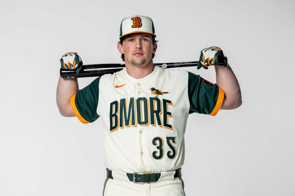
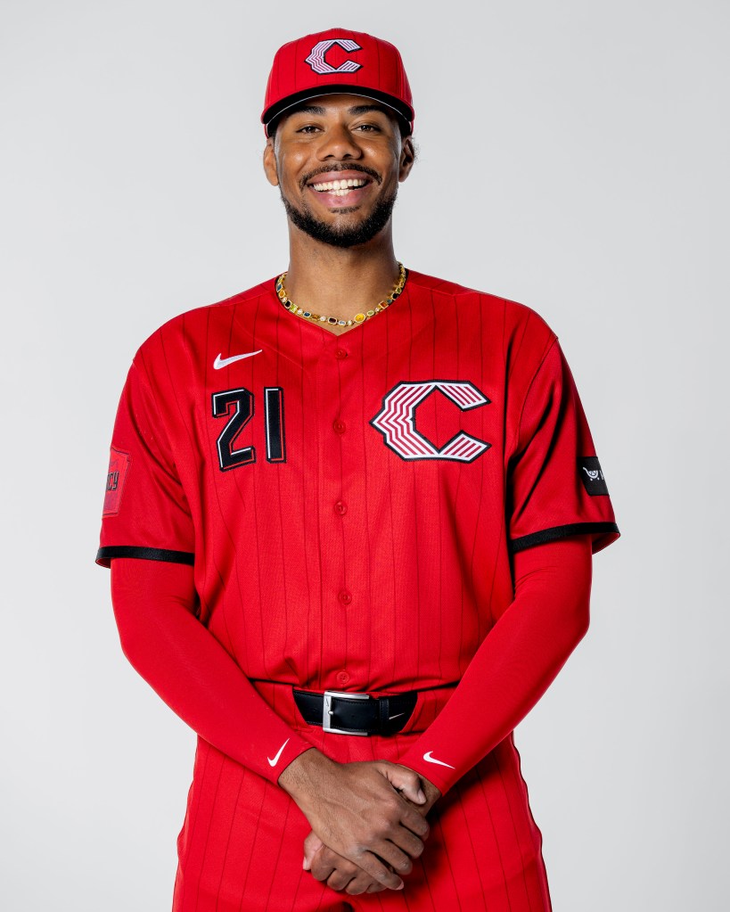
Photo Courtesy of MLB.com
The Cincinnati Reds: A tip of the cap is given to the Reds’ vest-style jerseys they wore in the past, and the sleeve features the Tyler Davidson Fountain, which begins to flow around Opening Day every year.
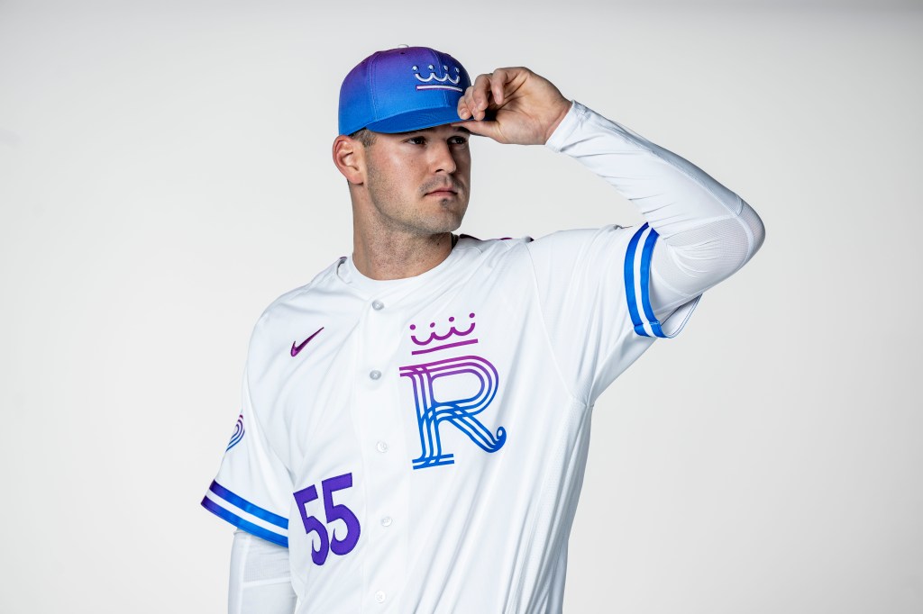
The Kansas City Royals: Highlighting Kansas City’s waterways, the fountain logo is adorned on the cap. Additionally, the new “R” logo pays homage to the club’s original logo from 1969.
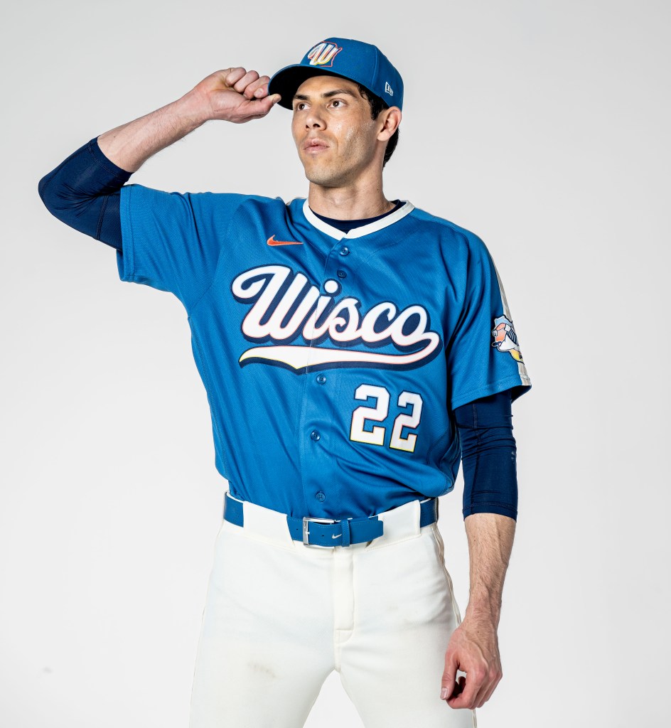
Photo Courtesy of MLB.com
The Milwaukee Brewers: The Brewers highlight being a Wisconsin team with the “Wisco” logo on the chest, while the color scheme evokes thoughts of the state’s lakes, bluffs, and other bodies of water. Additionally, the sleeve of the jersey features a redesigned Barrelman logo.
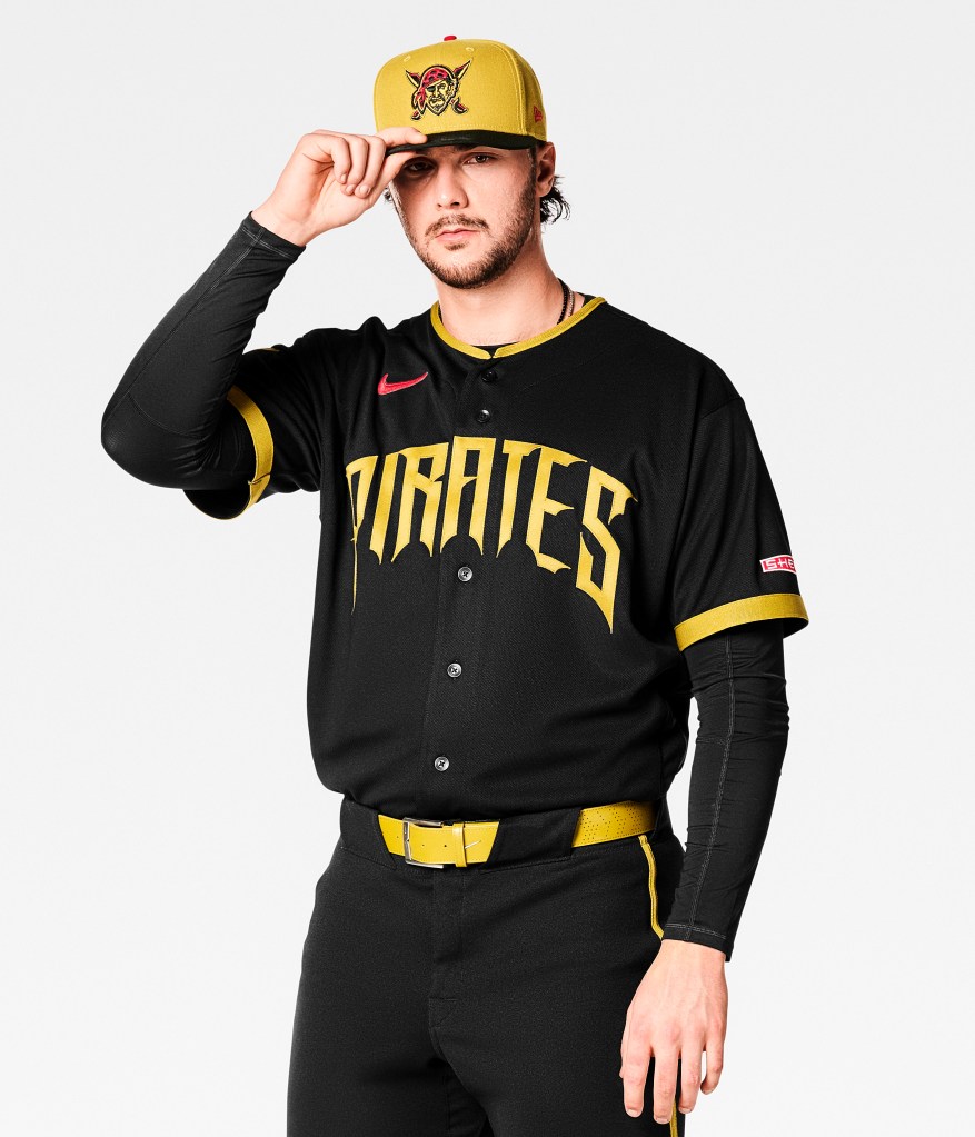
Photo courtesy of MLB.com
The Pittsburgh Pirates: The scripting draws on the city’s three sister bridges on the Allegheny River and the traditional black and gold that is paramount to Pittsburgh sports franchises.

Photo courtesy of MLB.com
The San Diego Padres: This uniform is based on Hispanic culture, featuring a patch that is for Día de los Muertos, and the color of the hat and jersey is skeleton-bone-white. Additionally, Mexican folk art is highlighted by the uniform’s papel picado jock tag.
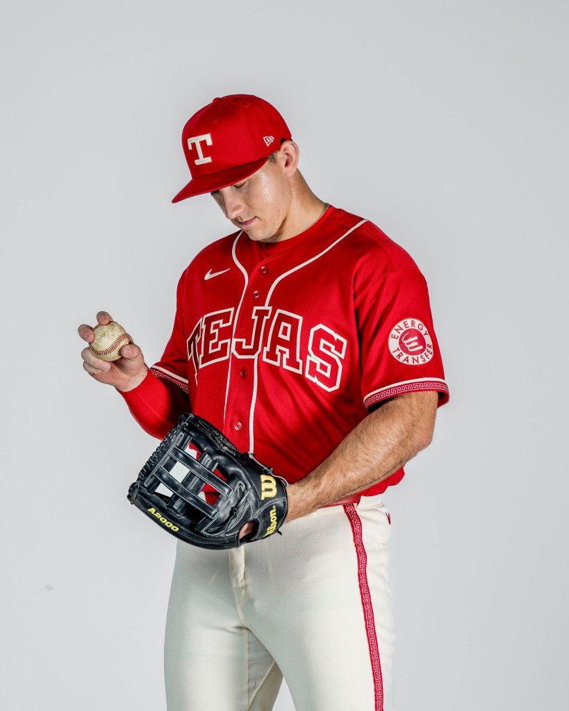
The Texas Rangers: The Rangers highlight their neighbors south of the border with the scripting “Tejas” across the front of the uniform. In a nod to Hispanic culture, the jersey features cochineal red anchors, and the belt has a maricachi-style pattern as well.
-Matt Koper
Founder of Koper’s Korner

Leave a comment